The client
Barcroft Estates is a new company formed by two highly experienced property people. They’re focused on assisting with and delivering often-complicated commercial property projects. They wanted to stand out in this field from their competitors, and move away from what they considered a ‘typical’ commercial development feel.
The project brief
A brand and a website please! Something away from the norm (within the sector) which was approachable, suggests subtle style. It needs to imply professionalism and sophistication without shouting it.
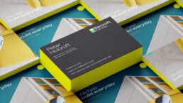
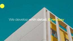
The brand
Bold Palettes and sans serifs in various weights. Photography was chosen to focus on specific but beautiful detail from landscape and architectural images, which echoed the personality and colour in the logo, and hints at the specialism of the company, which is rooted in their attention to detail.

The website
The site need to appeal to a broad selection of people, most of whom will be looking at it to check provenance and browse similar projects. It is not primarily for selling, more to showcase what they are working on, what has completed and to talk about the sector.


The Result
This fresh-out-the-box brand now stands out in the sector and communicates a clear purpose with style.