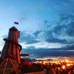
As you’ll see over on our case studies page, we helped the Cotswold Olimpick Games get back on its feet last year by creating a happy, country festival-type brand for 2018 to use on signs and the website etc. This year, we wanted to create something that was sufficiently different, something that was clearly a rural event, with an obvious nod to history but sporting a modern, almost tongue-in-cheek edge, which would accurately reflect the nature of this unique British event.
We decided to head down a different route than the last year, mostly because merchandise was being produced for 2019 – which will be for sale on the hill on the evening of 31st May – and it required something special to put on it.
So, we teamed up with Josh Hughes-Games of 16 Tonne Press.
Josh has bags of experience in screen printing and risographs and works from his studio slap bang in the heart of Bristol’s Old Market. We thought you’d be interested in seeing the updated designs for 2019 from Josh. The incongruity of the styles and historical references are bound to rub some purists up the wrong way, but we felt that the irreverent nature of these historic games (founded in 1612) required it, all imposed upon a 1960s-inspired dual-colour swirl, for good measure.
Have a look and let us know what you think. You can also see the event itself over here.

Other Insights

Fall In Love With Photography Again – Hit Delete
Fall In Love With Photography Again - Hit Delete “Photography can only represent the present. Once…
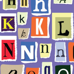
When Typefaces Go Rogue
When Typefaces Go Rogue "Don't ever diminish the power of words. Words move hearts and hearts move…
Making Time For Playtime.
Making Time for Playtime. “In every real man a child is hidden that wants to play.” ~ Friedrich…
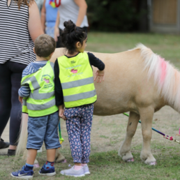
A drone, a tripod and a pony with a multicoloured mane
Whenever we create a website, brochure, ad or any other digital or print media for our clients,…
Why we like working with passionate people
Shuttlefish was born from a passion for advertising, with eye-catching artwork, engaging copy and…
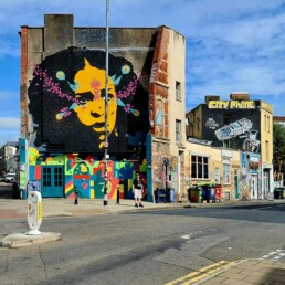
A grand day out at Dover’s Games
On Friday 1st June, the Shuttlefish team descended on Dover’s Hill to celebrate the 406-year-old…
Why we think long-distance relationships really do work
Have you ever been in a long-distance relationship? If so, you’ll no doubt have already formed…